


Building a SIOP KPI dashboard
Filed Under Blog
Back in our article on S&OP KPI’s we talked through some of the possible KPI options you may want to consider if you’re looking to put in place a set of metrics to support your Sales and Operational Planning process.
As you know doubt saw from the article as far as metrics go your spoilt for choice.
Of course, it’s not only selecting the right metric it’s also how you choose to present them. One of the things I find during consulting with my clients is just how many ways businesses use to display metrics. For example
* Some organizations use a monthly briefing slide pack built in powerpoint to communicate metric status
* Some use a metrics “bulletin” board placing physical metrics in situ
* Some have a section set aside on their company intranet
* Some organizations use custom software to collate and present KPI’s.
There are, indeed a myriad of ways to communicate these to the business population (Yes, I know these methods all vary in effectiveness but that’s a post for another day).
One thing that many of these organizations have in common is that they use a dashboard approach.
“What’s a dashboard” I hear you cry?
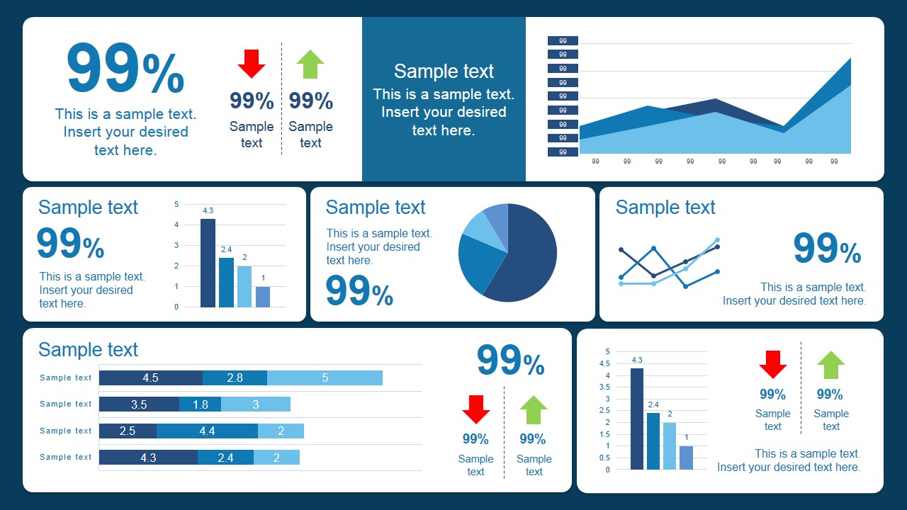
A dashboard is a combination of metrics/data into a single presentation method that’s used to convey performance as a single view.
Pretty neat huh?
Scorecards are nothing new and have been around an age and in the world of S&OP offer a metric “vehicle” to improve communication.
Wanna see some? Promise to come back? Cool, here you go….
https://cdn2.slidemodel.com/wp-content/uploads/7121-01-scorecard-slide-for-powerpoint-1.jpg (from Slidemodel.com>
http://supplychain.enchange.com/hubfs/fmcg_balanced_scorecard.jpg?t=1472478468566 (from http://supplychain.enchange.com)
http://www.blueprintbusinesssolutions.com.au/uploads/2/5/6/1/25617923/3368798.jpg (from http://www.blueprintbusinesssolutions.com.au)
So you get the idea. Group a set of metrics into a single view to tell a story.
Why Dashboards are so effective for S&OP
Sure you don’t need convincing of the importance of KPI’s but by grouping them together in a coherent way you instantly begin to see the relationship between the different levers in the S&OP process.
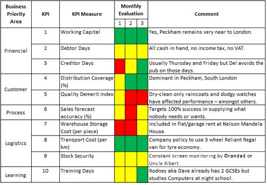
For example, forecast accuracy displayed along side some relevant metrics like, shortages, SOTIF, COTIF help put things into context rather than merely describe the ability to hit a solitary target.
With appropriate “curation”, the dashboard allows you to present critical information to help drive the business. The problem with metrics is that there are so many of them and it can be really hard to not fall into the death by charts approach to KPI’s and become overloaded by analysis.
The key to this, however, is that the KPI’s need to be curated i.e. you need to select the ones that are appropriate. Remember we’re using these metrics to help drive the results you’re looking for not just because it’s an area that seems obvious (or easy) to measure. This might take some trial and error to get right.
Once you get the S&OP dashboard right one of the first benefits you’ll notice is just how easy they make your S&OP meetings. I’ve seen organisations (that have tuned their dashboards over time use them as an agenda to help drive the dialogue (and by giving each slide an owner within the business this can become super effective at creating accountability).
When S&OP dashboards go bad.
Of course not everything is always rosy with dashboards. Unsurprisingly they can suffer the same malaise as general KPI’s
* Out of date data
* Use of the inappropriate KPI’s
* KPI’s “tuned” to hide bad news (general rule – KPI’s should always tell the truth)
* No targets/objectives
* No owner
* Presentation method used makes it complex to understand
Nothing new there but of course as we stated earlier you have the added problem with dashboards of grouping KPI’s that may not be related and fail to present a story.
Holding your S&OP accountable by having appropriate KPI’s is a must. There’s no getting away from the fact that a finely tuned dashboard is the best way to go. Accountability within the process is reinforced by selecting appropriate “owners” responsible for specific charts. Finally, don’t expect to get your dashboard right the first time. These take time to tune and get right.
Have some S&OP dashboard stories to share with our Supply Chain community? We’d love to hear about it in the comments section below…….